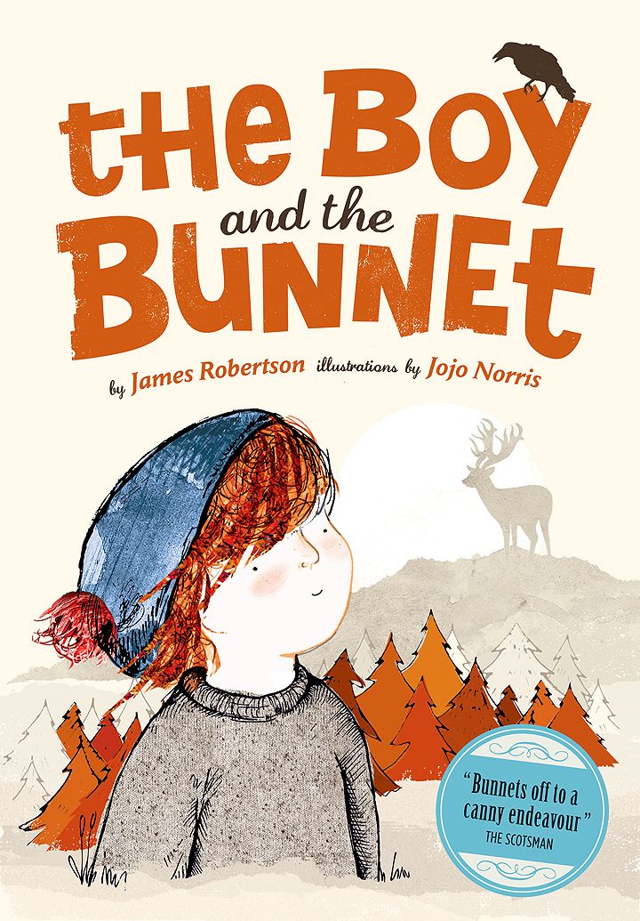
Scots version – front cover (The Boy and The Bunnet)
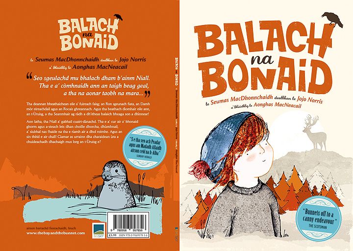
Gaelic version – front/back cover (The Boy and The Bunnet)
Gaelic version – front/back cover (The Boy and The Bunnet)
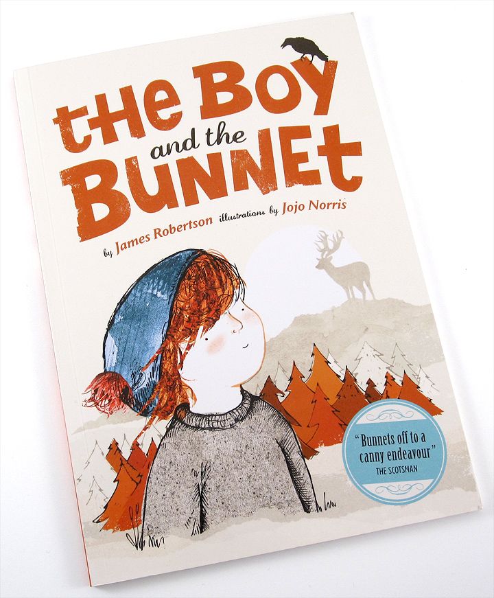
Scots version – front cover (The Boy and The Bunnet)
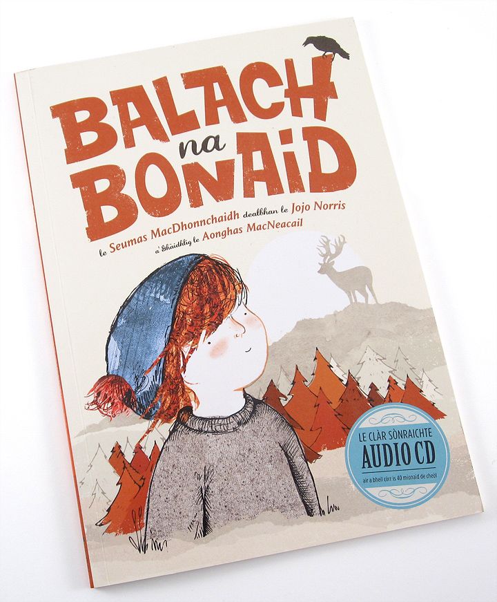
Gaelic version – front cover (The Boy and The Bunnet)
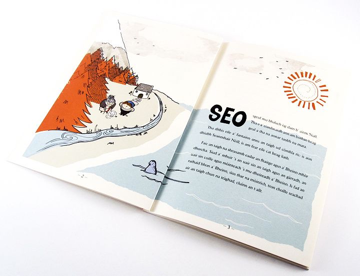
p2/3 (The Boy and The Bunnet)
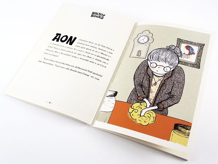
p4/5 (The Boy and The Bunnet)
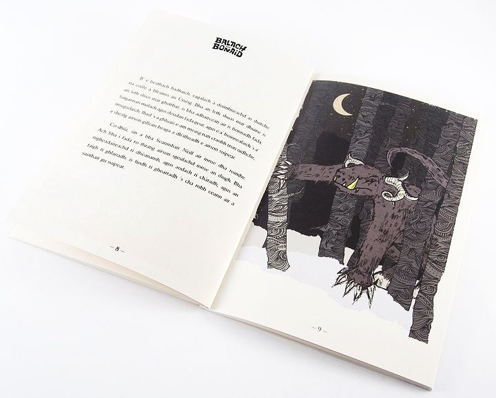
p8/9 (The Boy and The Bunnet)
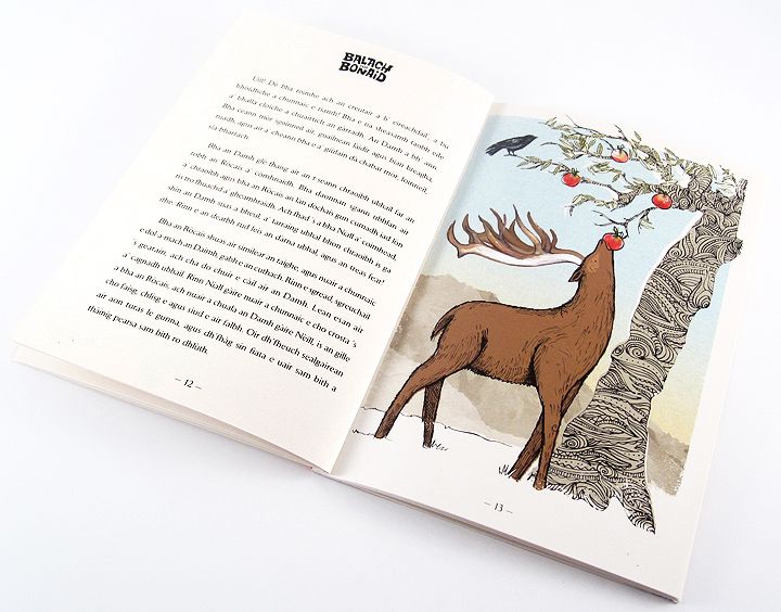
p12/13 (The Boy and The Bunnet)
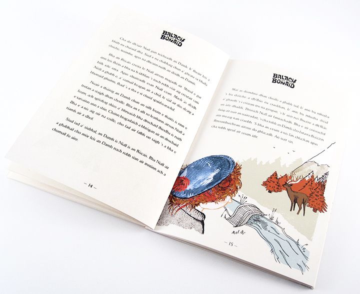
p14/15 (The Boy and The Bunnet)
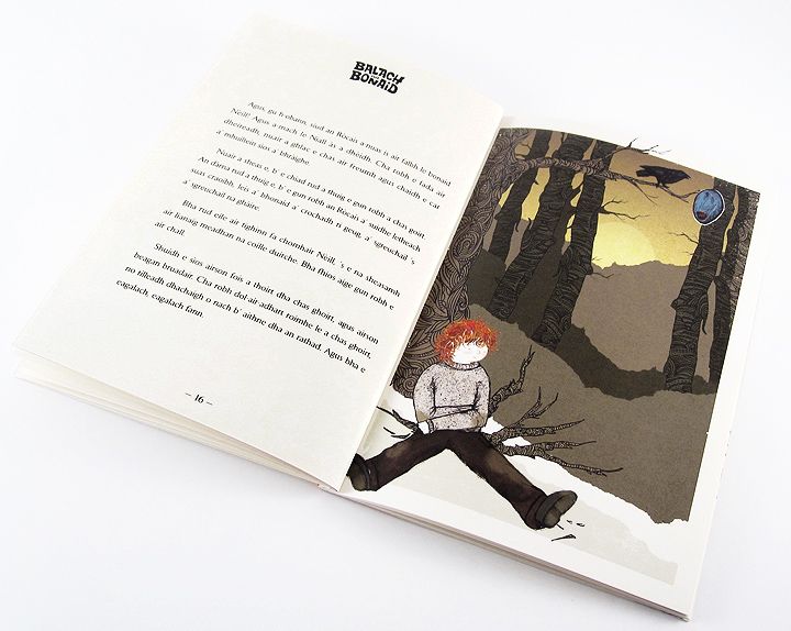
p16/17 (The Boy and The Bunnet)
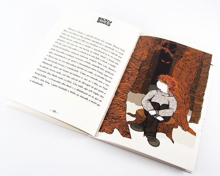
p20/21 (The Boy and The Bunnet)
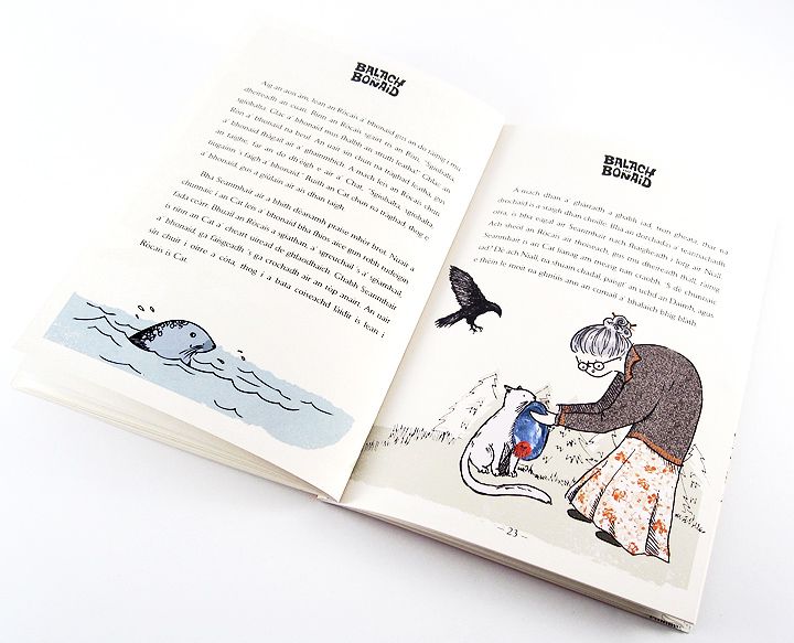
p22/23 (The Boy and The Bunnet)
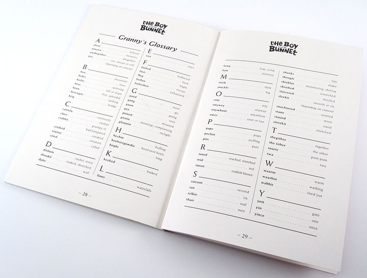
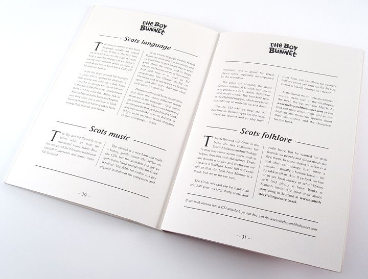
p28/29 (The Boy and The Bunnet)
p30/31 (The Boy and The Bunnet)
ABOUT THE PROJECT
The Boy and The Bunnet
BigSky Publishing
Children’s Book
We were brought in by BigSky Publishing to design and creative direct the production of their new children’s book ‘The Boy and The Bunnet’. The author James Robertson wrote an original tale in the Scots dialect, which was later translated into Scots Gaelic for two versions of the book.
We began by finding an illustrator for the project, we’d been impressed by the work of recent ECA graduate Jojo Norris, and feeling her style would suit the story, happily invited her to join the team. We then started on laying out the text of the story, planning where illustrations should go, how many were required, and writing a short brief for each to give to Jojo. She then got to work on these, generally supplying black & white, separate illustrations of each element within a scene.
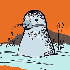
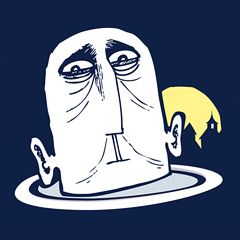
Using these black & white illustrations we designed each illustration to fit the story, adding additional elements where required (ie. a forest of trees), and arranging each scene to suit. Some illustrations remained very close to how they’d originally been draw, eg. the illustration of granny on p5. Some however were much more heavily rearranged by ourselves, eg. the front cover, which was created from separate b/w drawings of: the boy, a stag and a couple of trees.
We colored the whole book in a fresh, unique color scheme, created not only to suit the snowy Scottish winter locale of the tale, but also to portray a warm and friendly mood to balance with the themes presented. Scans of textures were also used occasionally in the coloring process to help add a bit of depth to the imagery eg. the boy’s jumper.
The book titles on the front cover (one in Scots, and one in Gaelic) were designed to further capture the warm natural feel of the story, whilst giving a chunky identity to both the publication and the future publicity.
We were really, really pleased with the final books, and although a lot of hard work, it turned into a unique and creatively rewarding project. Jojo Norris has since gone on to work for many clients across the country, and it was great to work so closely with such a fresh budding talent.
Music was also composed for a stage show of the story, and additional CD sleeves, programmes, posters & flyers were also designed and produced which can be viewed via a link below.
Tags

