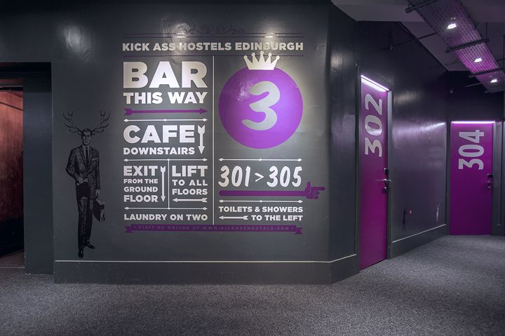
Internal signage – third floor (Kick Ass Hostels)
Internal signage – third floor (Kick Ass Hostels)
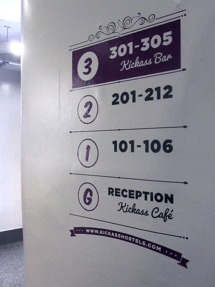
Internal signage – third floor (Kick Ass Hostels)
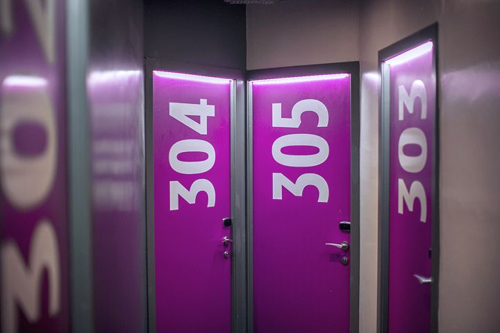
Room Door Numbers (Kick Ass Hostels)
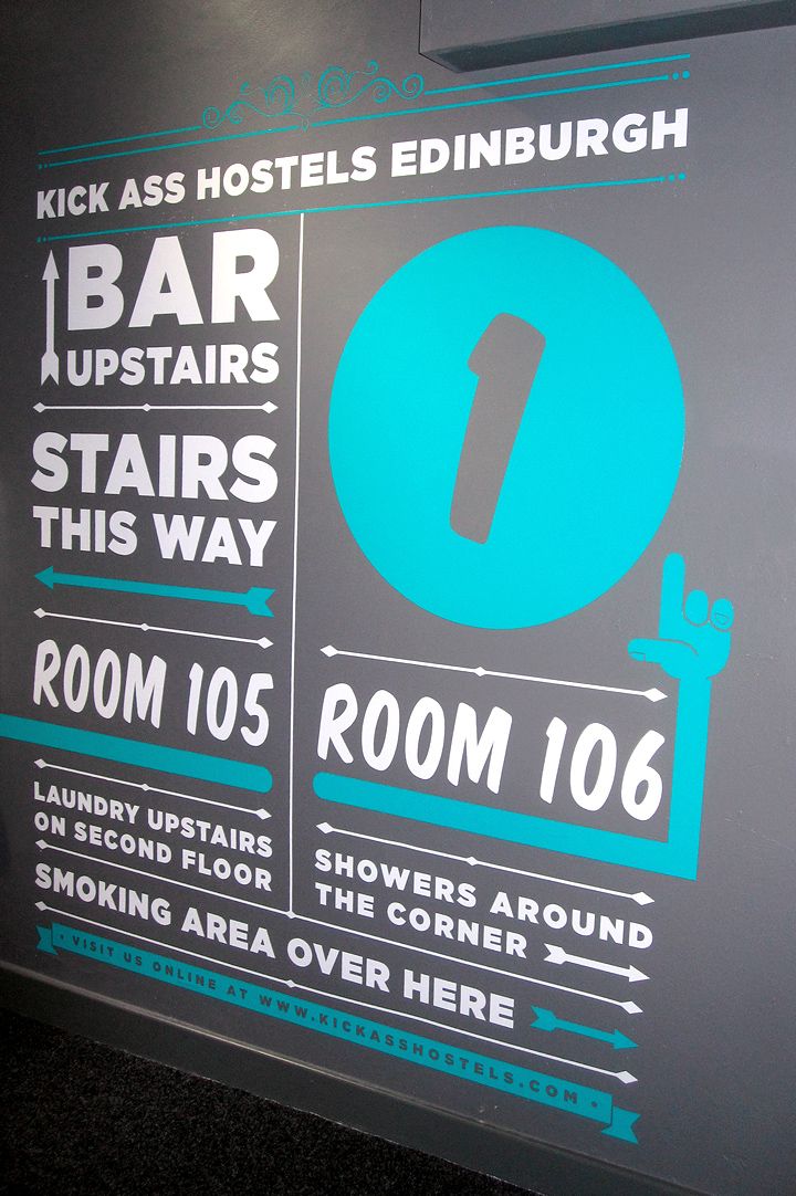
Internal signage – third floor (Kick Ass Hostels)
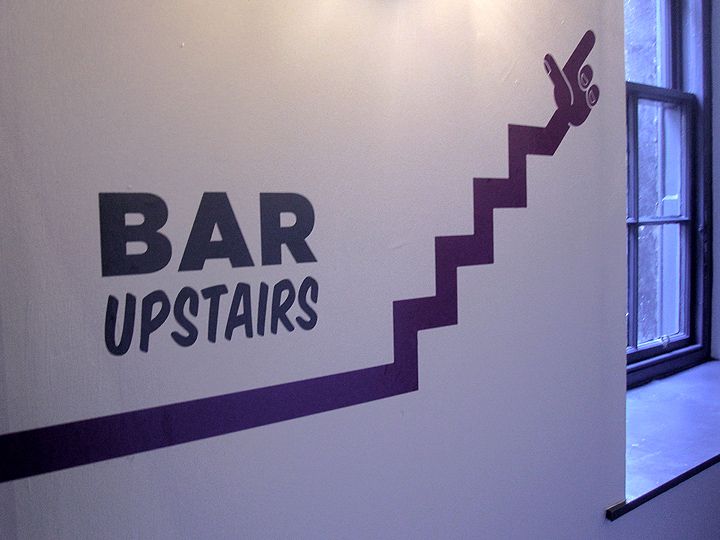
Internal signage – bar upstairs (Kick Ass Hostels)
Internal signage – lift sign (Kick Ass Hostels)
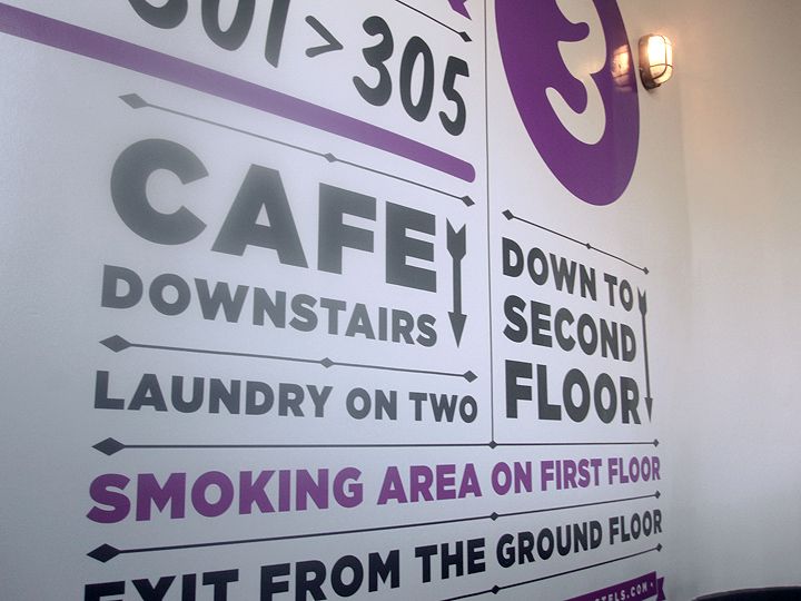
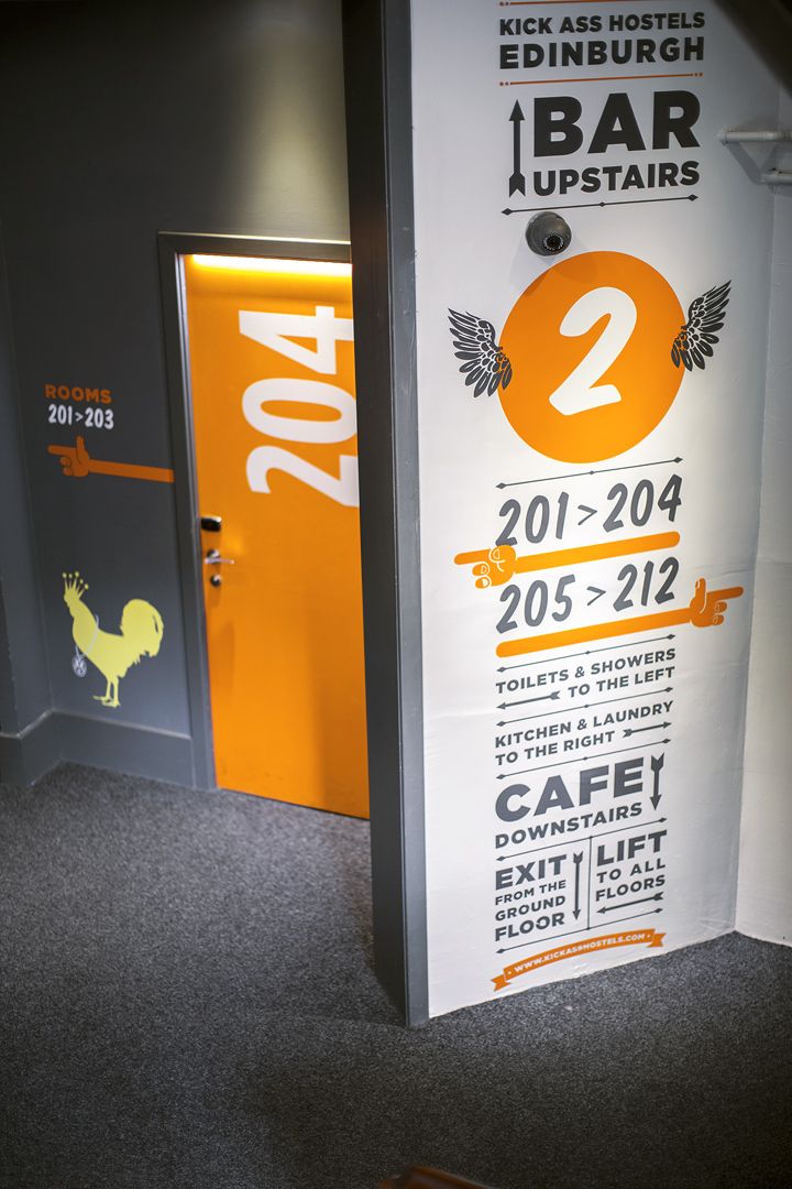
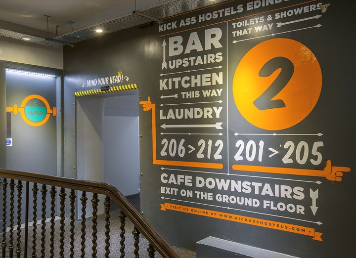
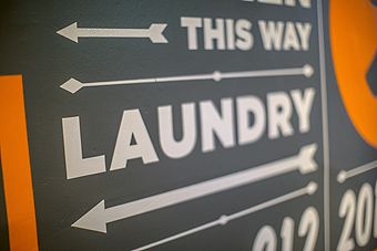
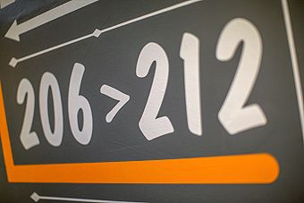
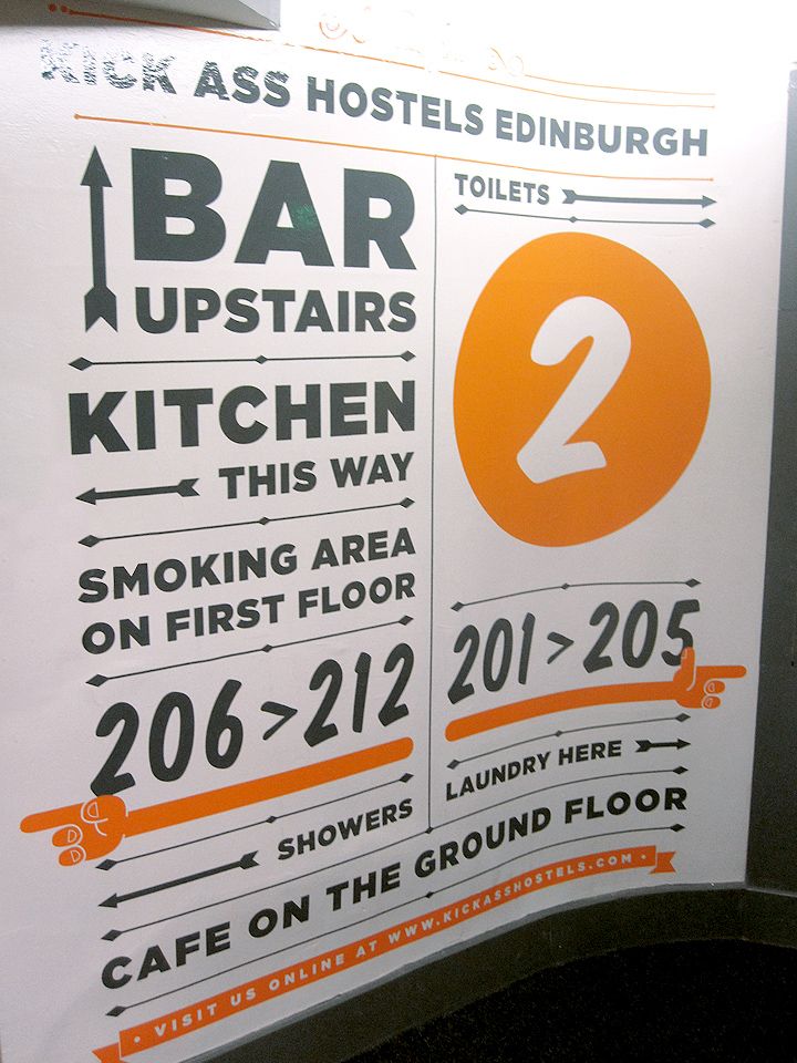
Internal signage – second floor (Kick Ass Hostels)
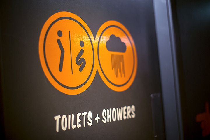
Door Signage – toilets & showers (Kick Ass Hostels)
Internal signage – second floor (Kick Ass Hostels)
Internal signage – second floor (Kick Ass Hostels)
Internal signage – second floor (Kick Ass Hostels)
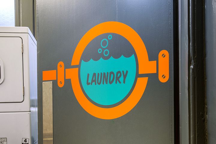
Door Signage – laundry (Kick Ass Hostels)
Internal signage – second floor (Kick Ass Hostels)
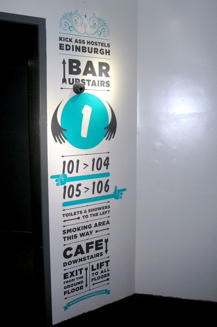
Internal signage – first floor (Kick Ass Hostels)
Internal signage – first floor (Kick Ass Hostels)
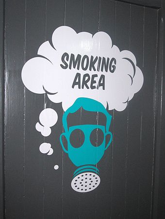
Door Signage – smoking area (Kick Ass Hostels)
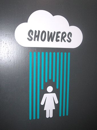
Door Signage – female showers (Kick Ass Hostels)
Internal signage – first floor (Kick Ass Hostels)
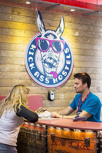
Wall Signage – reception (Kick Ass Hostels)
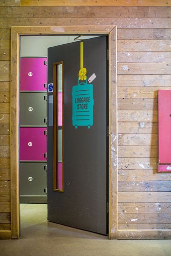
Door Signage – luggage store (Kick Ass Hostels)
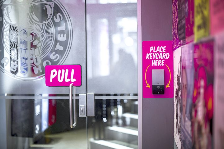
Internal signage – keycard entry (Kick Ass Hostels)
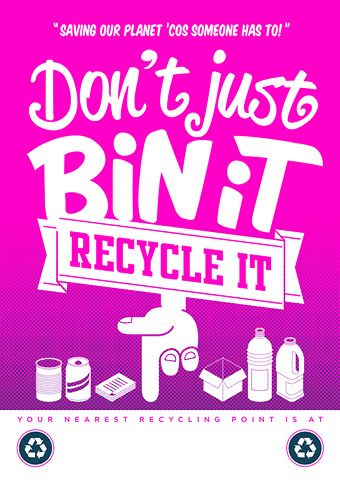
Recycling – A3 poster (Kick Ass Hostels)
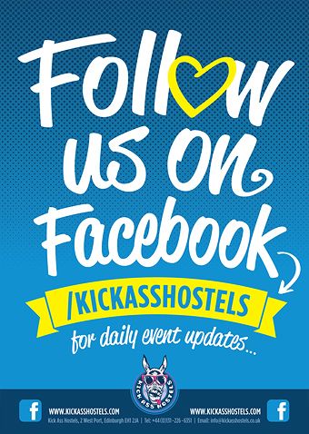
Follow us on Facebook – A3 poster (Kick Ass Hostels)
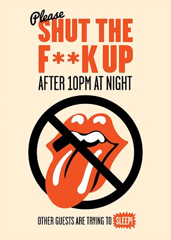
Keep Quiet after 10pm – A3 poster (Kick Ass Hostels)
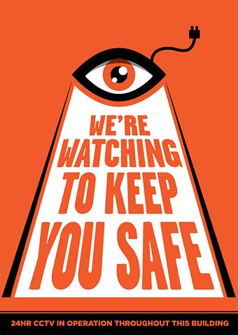
CCTV – A3 poster (Kick Ass Hostels)
ABOUT THE PROJECT
Internal Signage
Kick Ass Hostels
Vinyl
After previously working for their sister hostel Budget Backpackers, we were invited to create masses of work for their new business the Kick Ass Hostel in Edinburgh’s historical Grassmarket. We went with a fun but professional feel throughout, mixing clean typography with friendly fonts and some crazy illustrations! The designs all crossed classic design elements to represent the history of the city and the area itself, together with fresh modern design to fit with the younger clientele and the welcoming mood of the company.
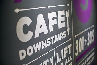
This page shows the internal directional signage, which we designed to be presented huge on the walls throughout the four storey building. The old Edinburgh building has an unusual layout and we needed to make traversing the corridors very clear to their guests. We chose to color code the artworks on each floor to further help navigation, using this bright color (aqua, orange & purple), as highlights throughout the designs.
Cartoon hands were used to point guests around the floors and these directional signs utilised them to draw focus to the all important room numbers. Additional locations were listed with their type size relating to their importance within the building.
Our designs were then produced in spot colored vinyl by our friends at Edinburgh’s Sign-a-rama, who also then installed the huge signage.
We’ve created various print advertising for the company since, with a few of our internal posters being presented here, following the bright friendly theme of the permanent signage.
We did a lot more design work throughout the venue with these directional signs being supplemented by additional feature illustrations which can be found elsewere on this site (or via the links below).
Tags

